
By Lisa Scottoline
I’m two months from getting the house painted, but I’m already fantasizing about paint colors. If the real estate classifieds are porn, paint chips are a kinky subculture, the S & M of home décor.
The pain is exquisite.
My fantasies began when my painter dropped off a big black case that contained huge books of paint chips. I’m not dumb, I’ve seen the paint chips that you get from Home Depot, but I’ve never seen one of these books. Each one weighs about three pounds, and the paint chips are bolted together with a single fastener, so you can slide the chips out to make a circle, like a merry-go-round of color. The painter gave me three books, each with hundreds of pages, and each page has seven paint chips. By my calculation, this equals four billion eleventy-seven gillion different colors.
It hurts so good.
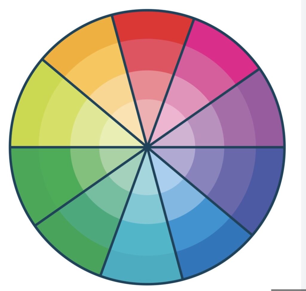
In no time, I’m sliding the paint chips out in a circle, the tangerines overlapping the marigolds, the cobalts eclipsing the limes, the pinks complementing the purples, all the colors fanning out from the center, making a 360° fountain of acrylic excitement.
I had no idea what color I wanted to paint the house, but all of a sudden, the books opened up a spectrograph of chromatic possibilities. The paint chips whirled together like spin art on the boardwalk, and all the colors of the rainbow were mine. I flashed on a childhood filled with Crayola crayons, from the starter eight to the big-girl double-layers of sixty-four. I thought of old-fashioned tins of watercolor paints, with rectangular wells for dirty water. I could paint the house any color I wanted, and the thought made me giddy.
There was nobody around to exercise good judgment. No saner head to prevail.
Yippee!
I should point out that there is precedent for my temporary color insanity. After my second divorce, I painted my kitchen the color of vitamin C, merely because nobody could stop me.
So I gazed at the paint chips and imagined golden shutters against the tan fieldstone of the house. Creamy ivory clapboard in the sunshine. Colonial molding painted classy forest green. Fascia the gentle hue of daffodils. I spent hours looking at the colors in all different kinds of light and made lists of the letters and numbers on each paint chip, a cryptic code that added to its tantalizing mystery. For example, Corinthian White was OC-111. I looked in vain for the meaning of OC, but the book kept its secrets.
I even found myself carried away by the names of the colors, some of which were delicious. I imagined shutters of Sharp Cheddar (2017-20). I considered doing the trim in Pale Celery (OC-114) and Carrot Stick (2016-30), low-carb colors. I could finish my molding in Peach Sorbet (2015-40), which was like eating windowsills for dessert.
Some color names struck an emotional chord, as in True Blue (2066-50), and others were adorable, like Tricycle Red (2000-20). Growing up, I had a red tricycle and a red wagon. I looked for a color named Red Wagon, but there was none. I made a mental note to email Benjamin Moore.
Still other names made me think of vacations – Caribbean Coast (2065-60), South Beach (2043-50), and Blue Wave (2065-50). But Asbury Sand (2156-40) didn’t look any different from Serengeti Sand (2164-40), and it’s probably easier to get a hotel in Jersey.
I was bothered by the names that made no sense. What’s a Jeweled Peach (2013-30)? Or Smoke Embers (AC-28)? There’s no such thing as smoke embers. Smoke comes from embers. Anyway, it was a Boring Gray. And between us, Adobe Dust (2175-40) looks suspiciously like the dirt under my bed, which I call Philadelphia Dust
Still other color names were a little precious. Roasted Sesame Seed (2160-40) isn’t a color, it’s a recipe. Mantis Green (2033-60) is just plain creepy. Dollar Bill Green (2050-30) is for pimps only.
Some color names confused me. Nantucket Gray (HC-111) is green. Gypsy Love (2085-30) is maroon, which has nothing to do with either Gypsies or Love. Soft Cranberry (2094-40), which should be maroon, is beige. And Milkyway (OC-110) is white like milk, not brown like the candy or black like the galaxy.
Kelp Forest Green (2043-30) is distinctly unhelpful. Shore House Green (2047-50) begs the question. Cherokee Brick (2082-30) is historically inaccurate. Distant Gray (2124-70) is emotionally unavailable. Amber Waves (2159-40) panders in an election year. There was no Purple Mountains Majesty.
Other names reveal that whoever thought them up was drunk. There is no other explanation for Perky Peach (2012-50), Springy Peach (2011-60), or Limesickle (2145-50). Maybe they were drinking Moonshine (2140-60).
By the end, I was supersaturated with color, hues, and tints, dizzy from my myriad paint fantasies. But at least I found the perfect color for the house.
White.
Copyright Lisa Scottoline